Key Insight
The 22.5% annual decay rate everyone quotes is a blended average. It hides a 3x spread between sectors. Refreshing your entire database on the same cadence is why pipeline forecasts miss.
Here’s the Decay Velocity Spectrum, the framework Span Global Services uses to set sector-aware refresh SLAs after 24 years of list operations.
A demand gen director walks into the Monday standup with a clean dashboard. Email deliverability looks fine. Bounce rates are inside the threshold. The CRM shows 1.4 million reachable contacts.
Six weeks later, the Q2 ABM campaign underperforms by 31%. The post-mortem blames creative. It blames timing. It blames the SDR cadence. It rarely blames the thing that actually broke: the SaaS slice of that 1.4 million was rotting at 60% a year while the manufacturing slice was rotting at 14%, and both got refreshed on the same quarterly cycle.
This is the silent killer in most B2B data quality programs. Not the decay itself. The assumption that decay moves at one speed.
After 24 years of building, refreshing, and operating B2B contact lists across 30+ verticals, the pattern is impossible to miss. Decay is sector-specific, predictable, and almost nobody is treating it that way.
The 22.5% Average Is a Trap
The Marketing Sherpa benchmark of 22.5% annual decay (roughly 2.1% per month) is real. It’s also one of the most misleading numbers in our category.
That figure is a blended average across every industry, every role level, and every contact field. Useful for a slide. Useless for a strategy. Recent research from Landbase put the actual range at 22.5% to 70.3% annually, depending on the sector and the number of fields tracked. That’s a 3x spread.
If you’re running quarterly refreshes for your entire database at the same cadence, you’re doing one of two things:
- Burning budget refreshing stable sectors that didn’t need it, or
- Letting volatile sectors rot for nine months between cleanups
Both leak pipelines. Neither shows up on a dashboard until the deliverability damage is already done.
The interesting question isn’t “how fast does B2B data decay?” It’s “how fast does my B2B data decay, given who I sell to?”
The Decay Velocity Spectrum
Across two decades of list maintenance, decay rates cluster into three repeatable tiers. We call this the Decay Velocity Spectrum, and it’s the framework we use to set refresh SLAs for client B2B contact databases.
Tier 1: Volatile Sectors (35% to 70% annual decay)
Who lives here: SaaS, technology startups, fintech, digital marketing agencies, recruiting and staffing, e-commerce, DTC brands, venture-backed companies under $500M revenue.
Why they decay fast: Average tenure is under three years. Constant funding rounds, acquisitions, rebrands, and shutdowns. Job titles inflate and shift quarterly. Email domains change after every M&A.
What this means for you: A SaaS contact verified ten months ago has roughly the same reliability as a finance contact verified two years ago. Treating them as equally fresh is a forecasting error before it becomes a data error.
Refresh cadence: Continuous trigger-based enrichment plus monthly bulk verification. Quarterly is too slow.
Tier 2: Mid-Cycle Sectors (20% to 35% annual decay)
Who lives here: Healthcare administration, financial services, insurance, professional services (consulting, legal, accounting), retail, education administration, and mid-market manufacturing.
Why they decay at this rate: Tenure runs 4 to 6 years. Sectors are subject to regulatory shifts and steady role mobility. Healthcare admin sees more churn than clinical roles. Financial services see compliance-driven movement.
What this means for you: This is where most B2B databases get neglected. Decay is slow enough that nothing screams, but fast enough that 30% of your records are wrong by year-end.
Refresh cadence: Quarterly verification, with semi-annual deep enrichment cycles for high-value accounts.
Tier 3: Stable Sectors (10% to 20% annual decay)
Who lives here: Government and public sector, traditional manufacturing, utilities, oil and gas, construction, K-12 education, defense contractors, and large hospital systems (clinical roles).
Why they decay slowly: Average tenure of 7 to 10+ years. Career paths are linear. Industries are mature, regulated, and structurally resistant to fast change.
What this means for you: You’re probably over-refreshing this segment. Annual verification is sufficient for most use cases. Spend the freed-up budget on Tier 1.
Refresh cadence: Annual full verification with event-triggered updates (M&A, leadership changes, facility relocations).
Key takeaway: One database, three refresh cadences. If you’re not running tiered SLAs, you’re either overspending on stable contacts or underspending on volatile ones. Usually both.
What Two Decades Reveals That Year-Over-Year Studies Miss
Most data decay research is built on 12-month observation windows. That’s a flashlight. Twenty-four years of list operations is a satellite map. A few patterns that only show up at scale:
- Decay accelerates after macro events, then resets to baseline. The 2008 financial crisis, the 2020 pandemic, and the 2022 to 2023 tech layoffs all produced 12-to-18-month decay surges in adjacent sectors, followed by a return to historical norms. Refresh strategies that assume steady-state decay under-prepare for every one of these events.
- Senior titles decay faster than mid-level titles in the same company. Counterintuitive but consistent. C-suite and VP roles turn over more aggressively than director and manager roles in most sectors. ICP lists weighted toward senior decision-makers decay faster than the sector average suggests.
- Phone numbers decay more slowly than emails, but become useless faster. Direct dials remain valid for years after a job change because numbers are portable. A valid phone number for a contact who moved to an unrelated role is a dead lead with a dial tone.
- Geography dwarfs vertical in some categories. APAC manufacturing decay rates run roughly half of the US tech decay. But US manufacturing decay sits much closer to the global average. Region matters as much as industry for global GTM teams.
These insights don’t come from a one-year study. They come from running B2B data services across the same client accounts for a decade or longer. That’s the wedge no AI-generated report can replicate.
Why This Matters More in the AI Era, Not Less
The temptation in 2026 is to assume that AI agents and automated enrichment make decay a solved problem. They don’t. They make it more expensive when it goes wrong.
An AI SDR running on a Tier 1 list refreshed quarterly is sending 40% of its outbound to invalid contacts at month nine. That’s not a content problem or a sequencing problem. That’s a fuel problem. AI agents amplify whatever data you feed them. Clean data, multiplied. Dirty data, also multiplied. The error rate scales with the autonomy.
The teams winning with AI-augmented GTM aren’t the ones with the largest contact databases. They’re the ones with the most accurately tiered ones. Sector-aware refresh isn’t a list hygiene tactic. It’s the foundation that makes data enrichment and AI workflows reliable.
The Refresh Cadence Playbook
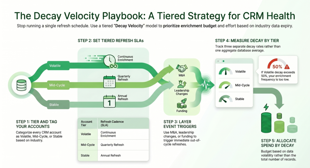
Stop running one refresh schedule for your entire database. Build a tiered cadence based on the Decay Velocity Spectrum.
Step 1. Tier Your Accounts
Tag every account in your CRM with a sector classification — Volatile, Mid-Cycle, or Stable. A simple industry-to-tier mapping table covers most cases and makes refresh planning easier.
Step 2. Set Refresh SLAs by Tier
Volatile sectors require continuous enrichment, Mid-Cycle sectors should follow quarterly verification, and Stable sectors typically need annual refreshes.
Step 3. Layer Event Triggers on Top of Cadence
M&A activity, leadership departures, funding rounds, and facility relocations should trigger immediate out-of-cycle refreshes regardless of account tier.
Step 4. Measure Decay Velocity by Tier
Track separate decay rates for Volatile, Mid-Cycle, and Stable sectors. A single blended metric hides underlying data quality problems and weakens forecasting accuracy.
Step 5. Allocate Spend by Decay Velocity
A million Stable contacts often cost less to maintain than a smaller Volatile segment. Budget allocation should follow decay velocity rather than raw record volume.
This is the operating model behind many high-performing B2B databases. Yet most organizations still rely on a blanket quarterly refresh cycle because it’s operationally easier, not strategically smarter.
The Real Cost of Treating Decay as a Single Number
The Experian and Gartner consensus puts the cost of poor data quality at $12.9 to $15 million per organization per year. That number assumes uniform decay. It undercounts the real cost.
When your Volatile tier decays at 60% and you’re refreshing it on the same cadence as your Stable tier, the bounce rate damages your sender reputation, which depresses deliverability across every tier. The cost compounds. Marketing automation scoring breaks. ABM spend hits the wrong contacts. SDRs lose mornings verifying titles instead of running discovery calls.
The fix isn’t more refresh frequency. It’s a smarter refresh frequency.
Where to Take This Next
If you’re running a single refresh cadence across your B2B database in 2026, you likely have a yield problem you haven’t measured yet. The first step is mapping your CRM against the Decay Velocity Spectrum to understand how your records are actually distributed across sectors.
Span Global Services has spent 24 years helping B2B teams across SaaS, healthcare, financial services, manufacturing, and mid-market verticals improve database performance through sector-aware enrichment strategies.
If a smarter refresh cadence and B2B data enrichment program could improve your pipeline efficiency, start with a free data audit. We’ll help identify your sector-wise decay velocity, tier your database, and uncover where your current cadence is leaking pipeline value.
Twenty-four years of list intelligence comes down to one operating principle:
Don’t refresh data. Refresh sectors.
Related Posts